The MAC (Macomb Area Conference) is the high school athletics conference in which LHS is in. It consists of 36 schools, ranging from Port Huron to Clawson. I decided to rank each school’s logo to determine which one is the coolest. FYI, this is all my opinion. If you disagree, leave a comment. Look for through the gallery for the photos!
36. Eastpointe Shamrocks- this logo is last place because it is literally only a shamrock. It has no vibe or personality, it is just boring.
35. New Haven Rockets- This logo is cool, but just weird. They could’ve done so much more with the rocket.
34. Cousino Patriots- I chose to have the “block C” be their primary logo because they use that the most. The simple design is why it’s at #34. However, their alternate logo, “Pat Patriot” is a very sweet logo, but we’re not ranking alternate logos.
33. Roseville Panthers- I just think this logo is ugly and the claw looks out of place.
32. Lake Shore Shorians- What is a shorian? I don’t think they know either because they chose this as their logo.
31. Center Line Panthers- Similar reasoning as Roseville, I can’t determine if the CL or the panther is out of place. But at least the panther looks cool.
30. Warren Woods Tower Titans- I like the blue and silver combo, but the weird stacking of the letters ruins it.
29. Marine City Mariners- A lot of wasted potential, it looks like they scribbled a black line over MC.
———-COPYCAT SECTION————-
28. Sterling Heights Stallions- Copying the Denver Broncos and just changing the colors
27. Eisenhower Eagles- Copying the Philadelphia Eagles, I like the eagle better than the stallion.
26. Utica Ford II Falcons- Copying the Atlanta Falcons, I like the shiny effect it gives off
25. Marysville Vikings- The next three teams copy the Minnesota Vikings, Marysville does the least change to the logo
24. Hazel Park Vikings- They added the HP
23. Grosse Pointe North Norseman- They added some changes to the original logo but its still a copycat.
22. St. Clair Saints- Copying the New Orleans Saints, the SC goes good with the fleur de lei.
21. Utica Chieftains- Copying the Utah Utes
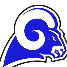
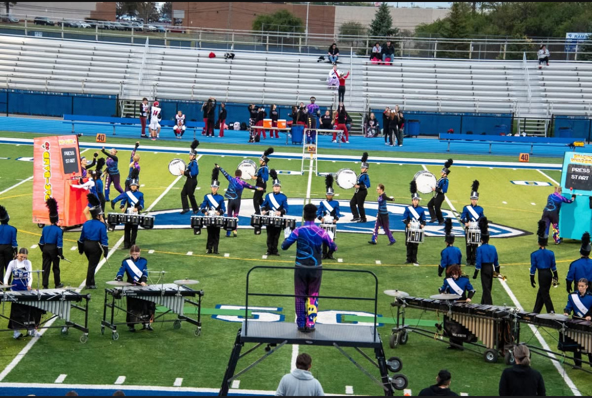
20. Lamphere Rams- Copying the Los Angeles Rams, I could only put it so low.
19. South Lake Cavaliers- Copying the Cleveland Cavaliers. The best copycat logo in the MAC. Not only because it’s my King Bron’s hometown team, but it’s a sweet logo.
——————————————————
18. L’anse Creuse North Crusaders- Boring logo but the black and gold color concept is always cool.
17. Warren Mott Marauders- Cool logo with the abbreviations and swords. The maroon and silver also go good together.
16. Dakota Cougars- Massive school. The green and blue look funny together
15. Madison Eagles- Not quite copying the Philadelphia Eagles, looks cool and different. The purple and gold go good together.
14. Chippewa Valley Big Reds- Could you say this is copying Utah? Yes, but no. It looks cool and deserves to be where it is.
13. Lakeview Huskies- This logo looks very robotic and could be much lower, but I like it.
12. Fraser Ramblers- Intimidating logo with the blue and white bronco. The F feels forced though. Including this one, the logos are amazing.
11. Romeo Bulldogs- This guy is a little freaky with the way his tongue is out at me. Very cool logo but I feel like it looks too much like UGA.
10. L’anse Creuse Lancers- Very simple but amazing logo. It hurt me to put it this low.
9. Stevenson Titans- Very nice titan with the red helmet incorporating all the colors. The “block S” feels forced and out of place, if it were just the titan, it would be higher.
8. Port Huron Northern Huskies- The blue and yellow go together very well and the husky is very well drawn and placed.
7. Port Huron Red Hawks- The red hawk is one of my favorite logos, but the PH looks a little funny and you can’t put this logo on a football helmet.
6. Clawson Trojans- Controversial pick but the way the Trojan looks is almost perfect.
5. Clintondale Dragons- Classic logo, I like the way the dragon makes a C
4. Anchor Bay Tars- Inspired by the Texas A&M logo, the incorporation of the anchor and the A&B goes together so well.
3. Fitzgerald Spartans- The crest spells out “Spartans”. Very tuff logo.
2. Grosse Pointe South Blue Devils- The detail in the face and little stache is so cool.
1. Lincoln Abes- How many logos have a president in it.